Feature your business, services, products, events & news. Submit Website.
Breaking Top Featured Content:
Visualizing The U.S. Housing Frenzy In 34 Charts
Tyler Durden
Sun, 10/04/2020 – 16:00
While the Fed was fully aware its actions in March – when it launched Unlimited QE and started purchasing corporate bonds and ETFs – would result in an already massive bond and credit bubble becoming bigger than ever, it probably did not anticipate that this would be accompanied by another epic housing bubble to boot.
Indeed, after briefly slowing in the second quarter, the plunge in mortgage rates to record lows, the exodus from urban rental units to suburban single-family houses has unleashed a home-buying frenzy with national house prices rapidly accelerating in the third quarter with the Case-Shiller and FHFA house price indices pointing to 8% and 13% annualized month-over-month growth rates as of July, respectively, roughly 5-8x more than average wage growth.
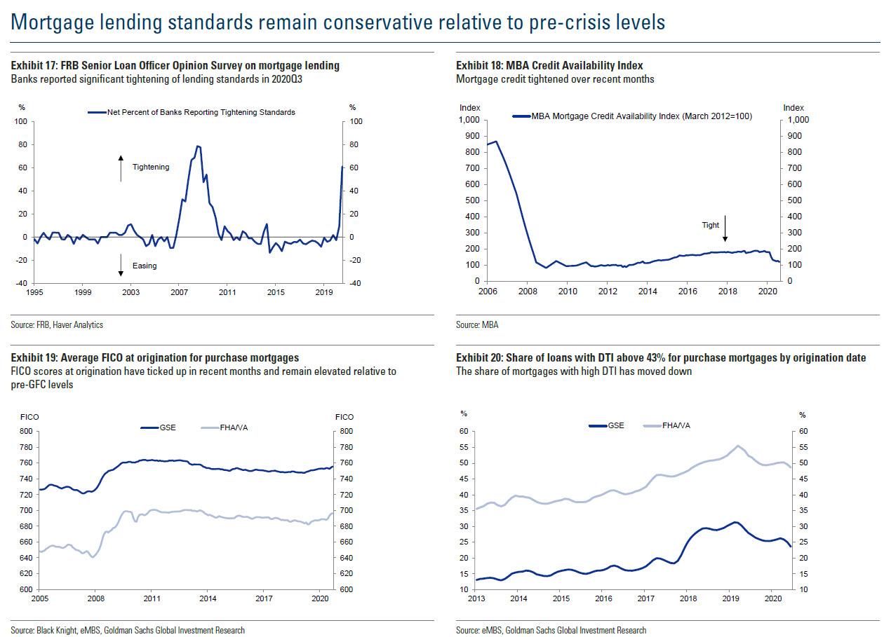
As a recent analysis by Goldman’s housing team shows, price growth remains strongest in relatively affordable markets, with Phoenix, Charlotte, and Tampa recording >5% annual house price appreciation, while within most metro areas, lower price tier homes continue to outperform on the back of robust demand and constrained supply of affordable homes. Paradoxically, the upward acceleration in home prices is not being driven by loosening lending standards – on the contrary, average FICO scores for purchase originations are up and average LTV and DTI ratios are down year over year.
While US house price growth has been blistering up in recent months, rent growth is slowing. The Zillow rent index shows a 1.2% annualized quarter-over-quarter growth rate as of August, down from a 3.4% growth rate a year ago. Similar patterns of deceleration are seen in the CoStar apartment rent and the Census Bureau’s owner’s equivalent rent data series. Rent growth is weakest in the higher priced markets: rents are down 9% year over year for class A apartments in San Francisco where the housing bubble has finally burst, but up 5% for class B apartments in Phoenix.
In the following charts, we show the just how the latest housing bubble emerged in 6 short months and has unleashed a tide of higher prices across the US real estate market.
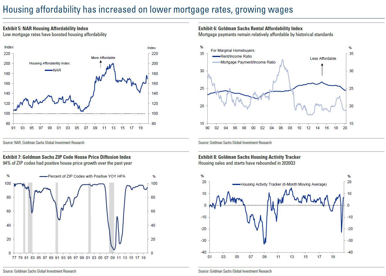
We start with housing affordability, which has rarely been higher on lower mortgage rates and growing wages:
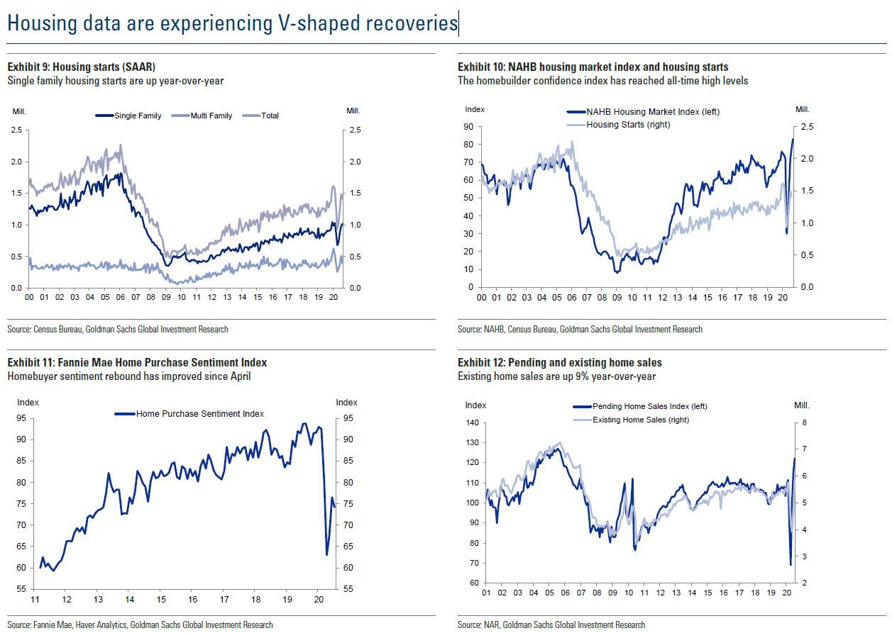
After a brief dip, housing data is surging higher:
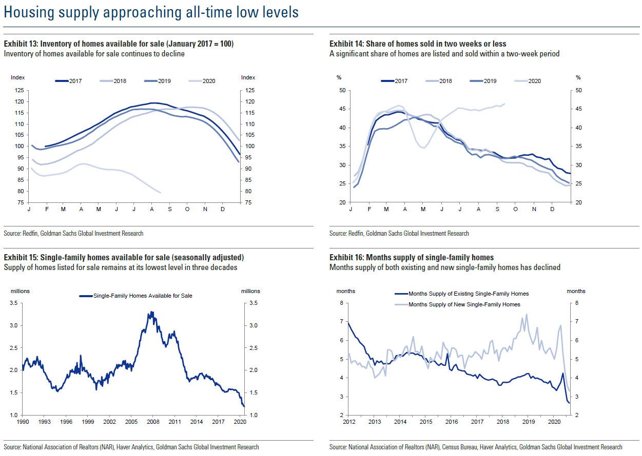
Surging demand for new and existing homes means a collapsing housing supply:
At the same time, mortgage lending standard have actually tightened, thus preventing a 2007-deja vu:
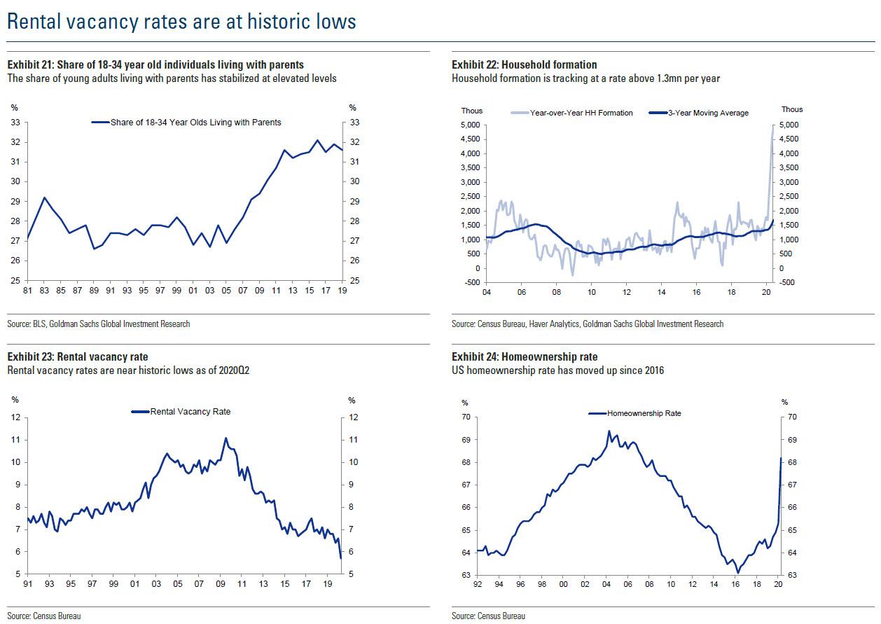
Meanwhile, despite the outward flood of urban residents who have been turned off by the covid shutdowns and the recent surge in antifa rioting, rental vacancy rates remain at historic lows (even as the share of young Americans living with their parents is at all time highs), driven by a surge in household formation and a jump in the homeownership rate.
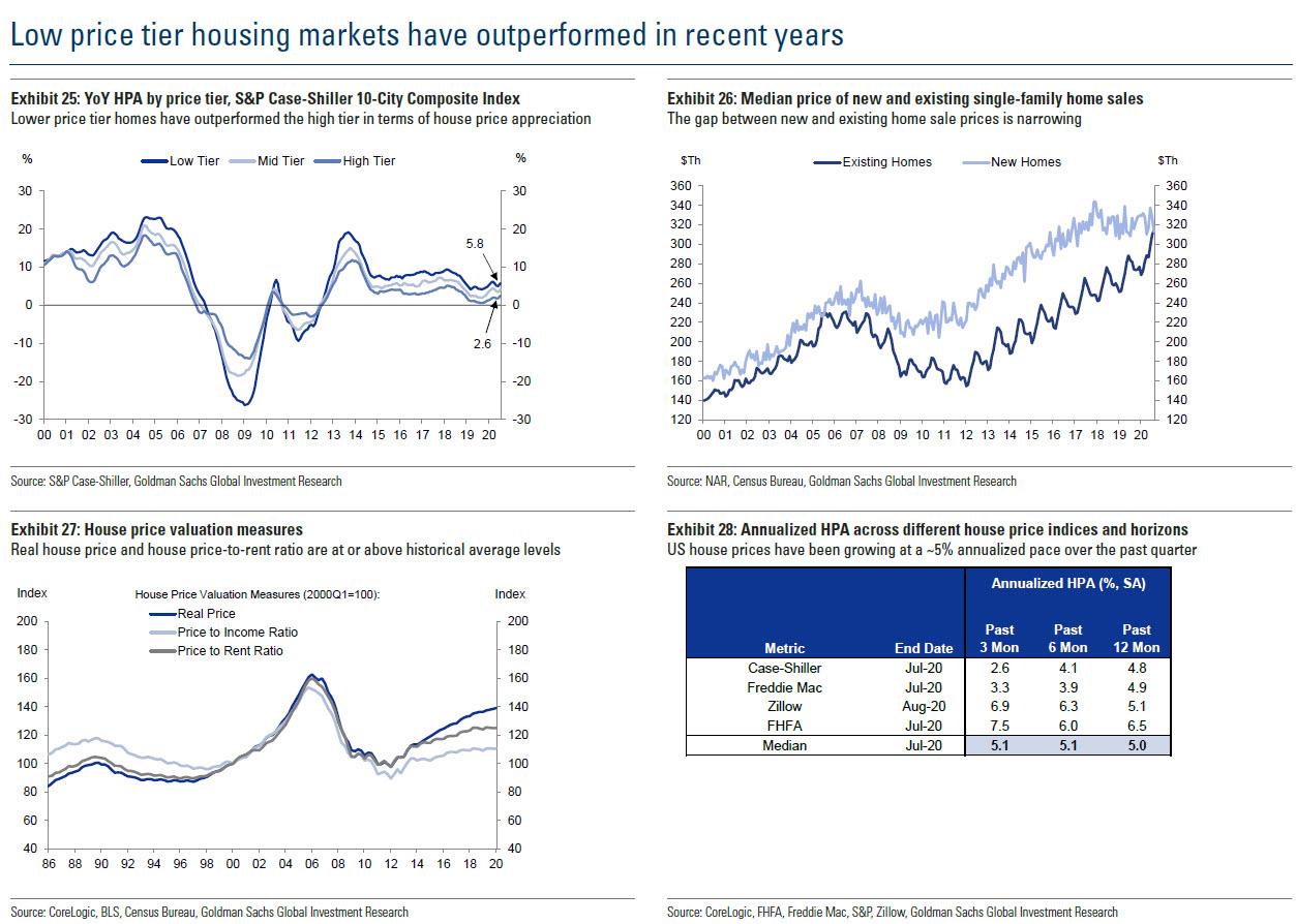
While everyone is benefiting from the surge in housing, low price tier housing markets have outperformed in recent years…
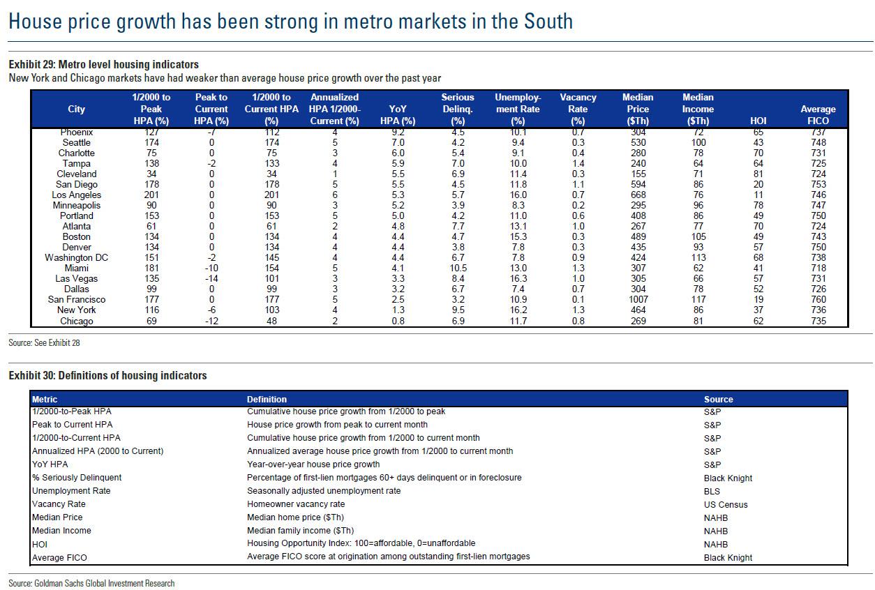
… with the strongest house price growth in Southern metro areas:
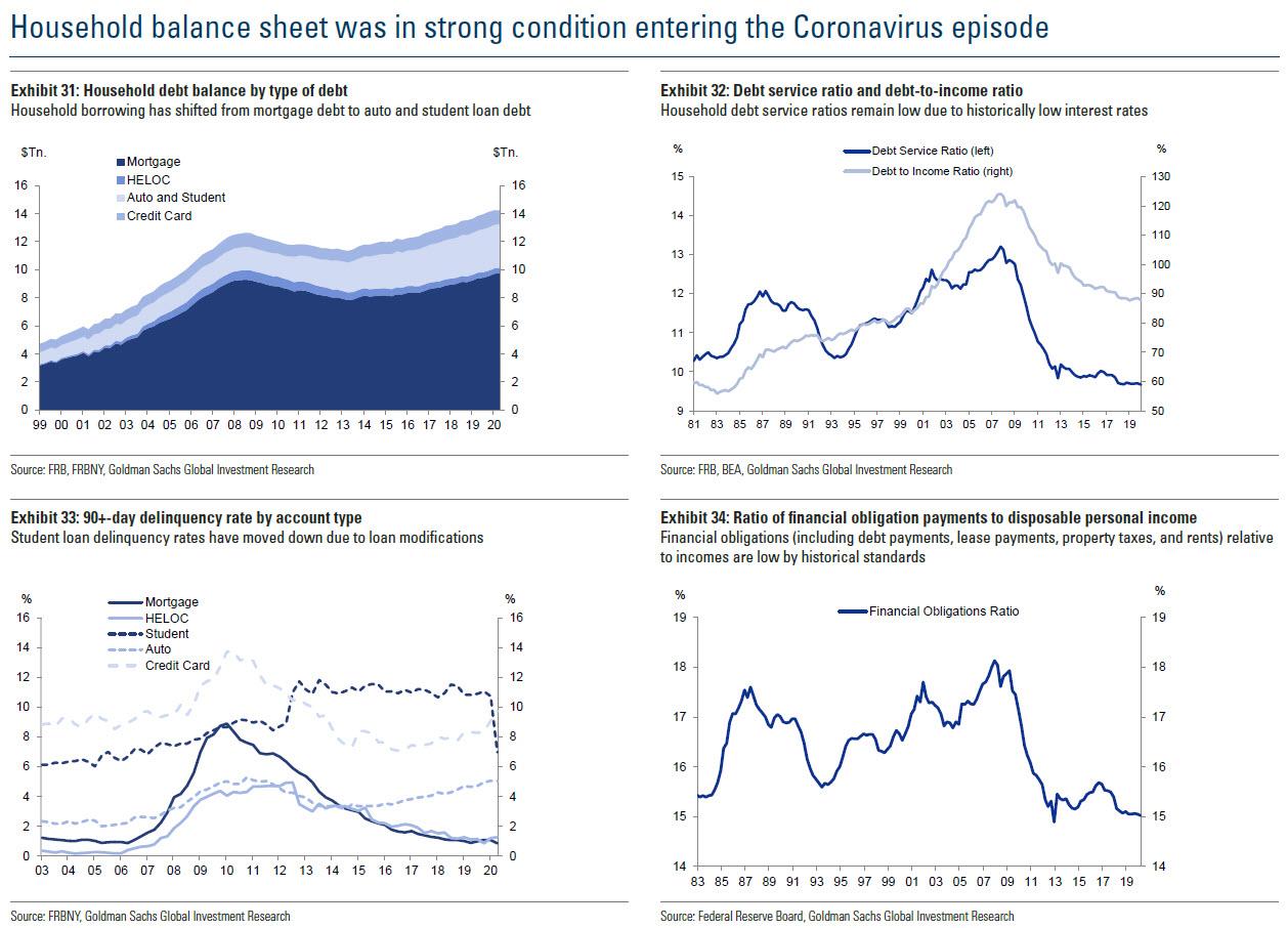
Looking at the household balance sheet, it continues to improve (at the expense of the corporate and sovereign balance sheet, both of which are catastrophic), with debt service ratios and delinquency rates subdued. In short, record low interest rates allow Americans to spend more on discretionary purchases.
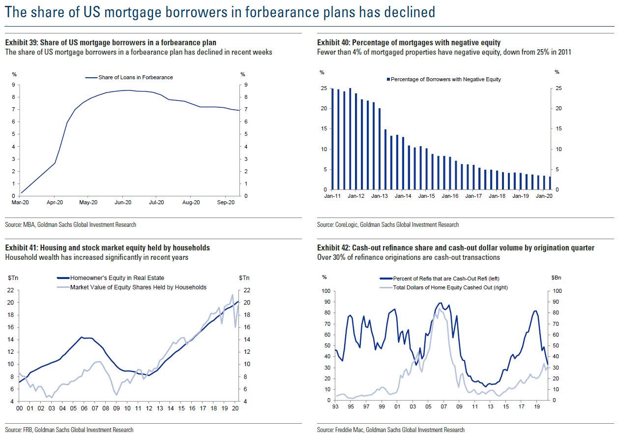
Finally, at a time when record amount of household wealth is located in real estate with cycle lows in negative equity mortgages, the best sign in this post-covid era that housing will remain strong is that after soaring in March and April, the share of loans in foreclosure has declined steadily in recent months.
Continue reading at ZeroHedge.com, Click Here.

