Feature your business, services, products, events & news. Submit Website.
Breaking Top Featured Content:
iCare Solutions Announces a New Release of its COVID-19 Dashboard with more Coverage for the US
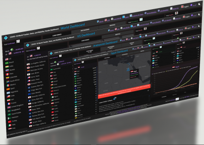
New US-Dedicated Dashboards to track COVID-19 reported cases across State/Counties and to explore, analyze, and compare Google Mobility Reports for both States and Counties
(PRUnderground) September 7th, 2020

iCare Solutions has launched a new release of its COVID-19 World Tracker App with new US-Dedicated Dashboards and Google Mobility Reports for US States and Counties, enabling US users to get statistics regarding the current outbreak of COVID-19 in the US and around the world and gain insights about the pandemic such as how rapidly the virus is expanding and how US communities are moving around differently due to COVID-19.
“After the successful launch of our COVID-19 World Tracker App, which provides worldwide coverage and the ability to explore, analyze, and compare COVID-19 data and Google Mobility Reports across countries, we decided to offer a special coverage for the US and include new features to allow US users to explore, analyze, and compare COVID-19 data across US counties and be able to easily explore Google Mobility Reports and flexibly compare their data across US states and counties. Therefore, we have added two new US-dedicated dashboards for COVID-19 data and for US Mobility Reports to our App and launched a new version,” said Dr. Hesham Mansour, CEO of iCare Solutions.
COVID-19 World Tracker, Stats, and Mobility Trends App
COVID-19 World Tracker App is an interactive dashboard style App that includes multiple dashboards to track COVID-19 reported cases, perform data analysis and comparisons for COVID-19 data across countries, and explore and compare Google Mobility Reports.
The tracking feature includes four main dashboards; the first one is for the entire World (shown in Figure 1), the second one is dedicated for the US (shown in Figure 2), the third one is dedicated for the Arab World (shown in Figure 3), and the last one is dedicated for Egypt (shown in Figure 4).
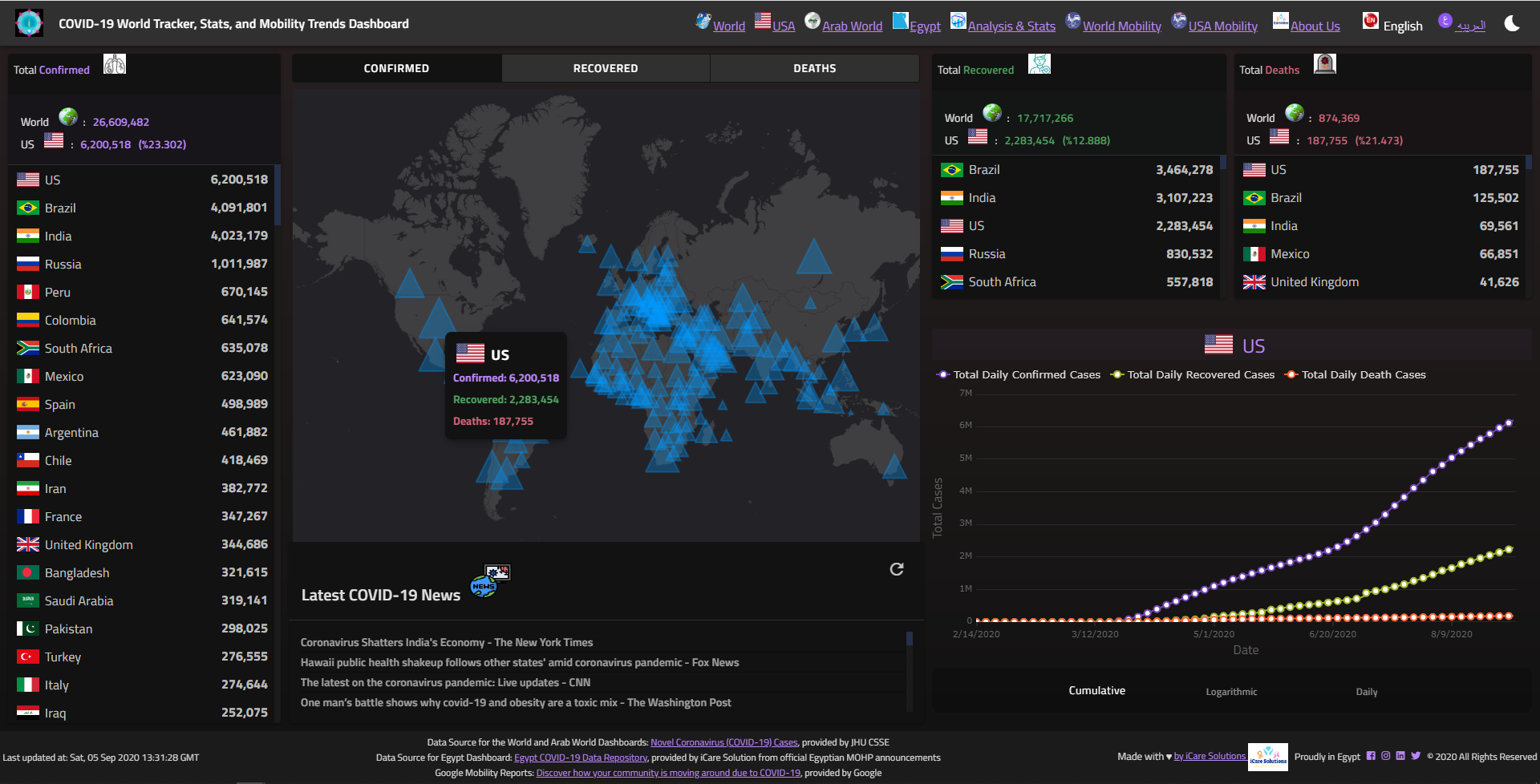
Figure 1. The World Dashboard
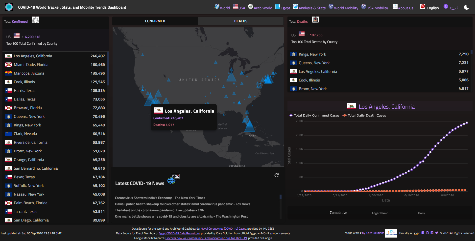
Figure 2. The US Dashboard
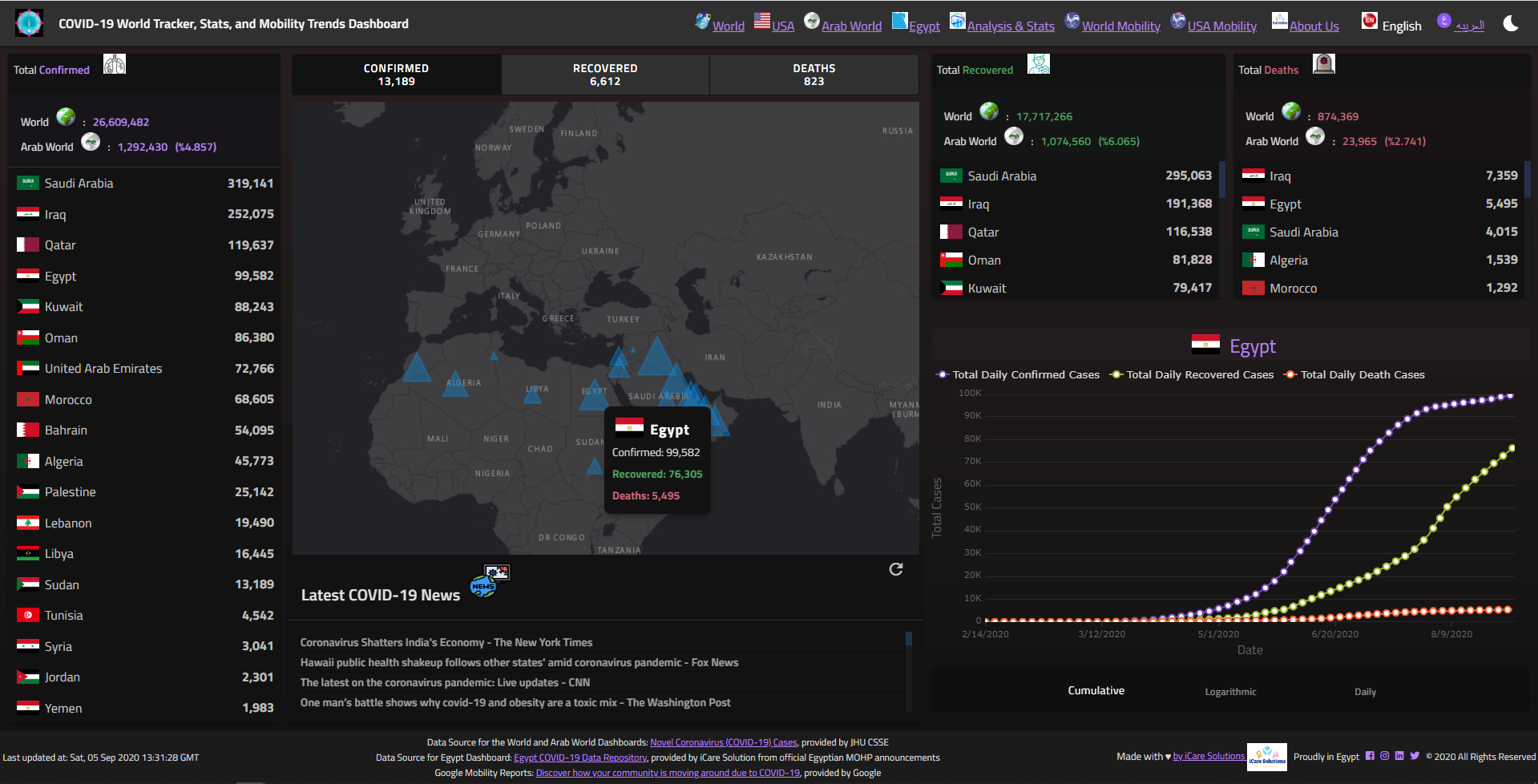
Figure 3. The Arab World Dashboard
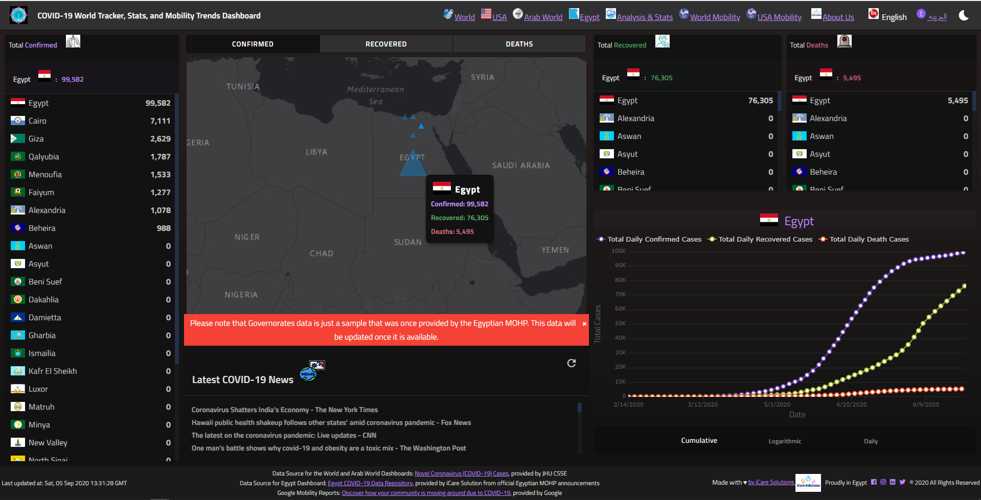
Figure 4 Egypt Dashboard
The Tracker Dashboard provides three different types of graphs (Cumulative, Logarithmic, and Daily graphs) that show current and historical COVID-19 confirmed, recovered, and death cases for a selected Country, US County, or Egyptian Governorate (shown in Figure 5).
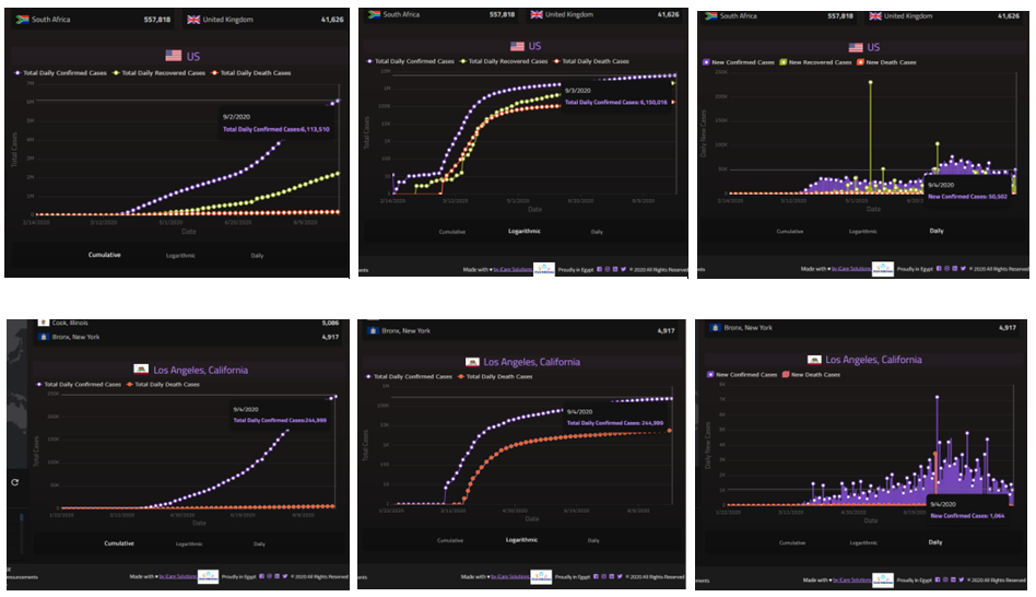
Figure 5. The Cumulative, Logarithmic, and Daily Graphs of the Tracker Dashboard
The Data Analysis and Stats Dashboard includes an interactive data grid for COVID-19 Stats along with a Default Graph for the first five countries (shown in Figure 6) and a Dynamically created Graph for comparing the data across any number of countries (shown in Figure 7).
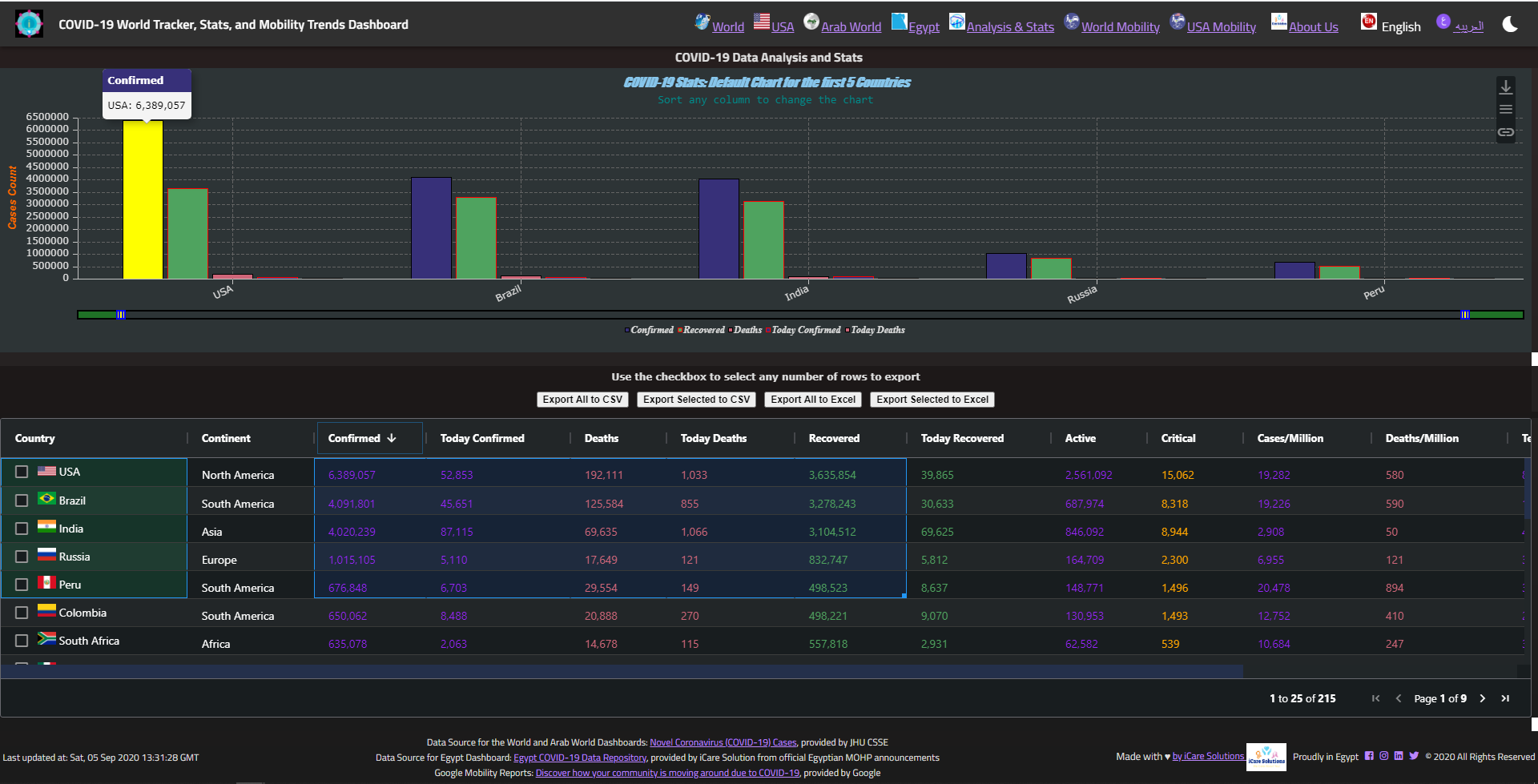
Figure 6. The Data Analysis and Stats Dashboard with Default Graph for the First Five Countries
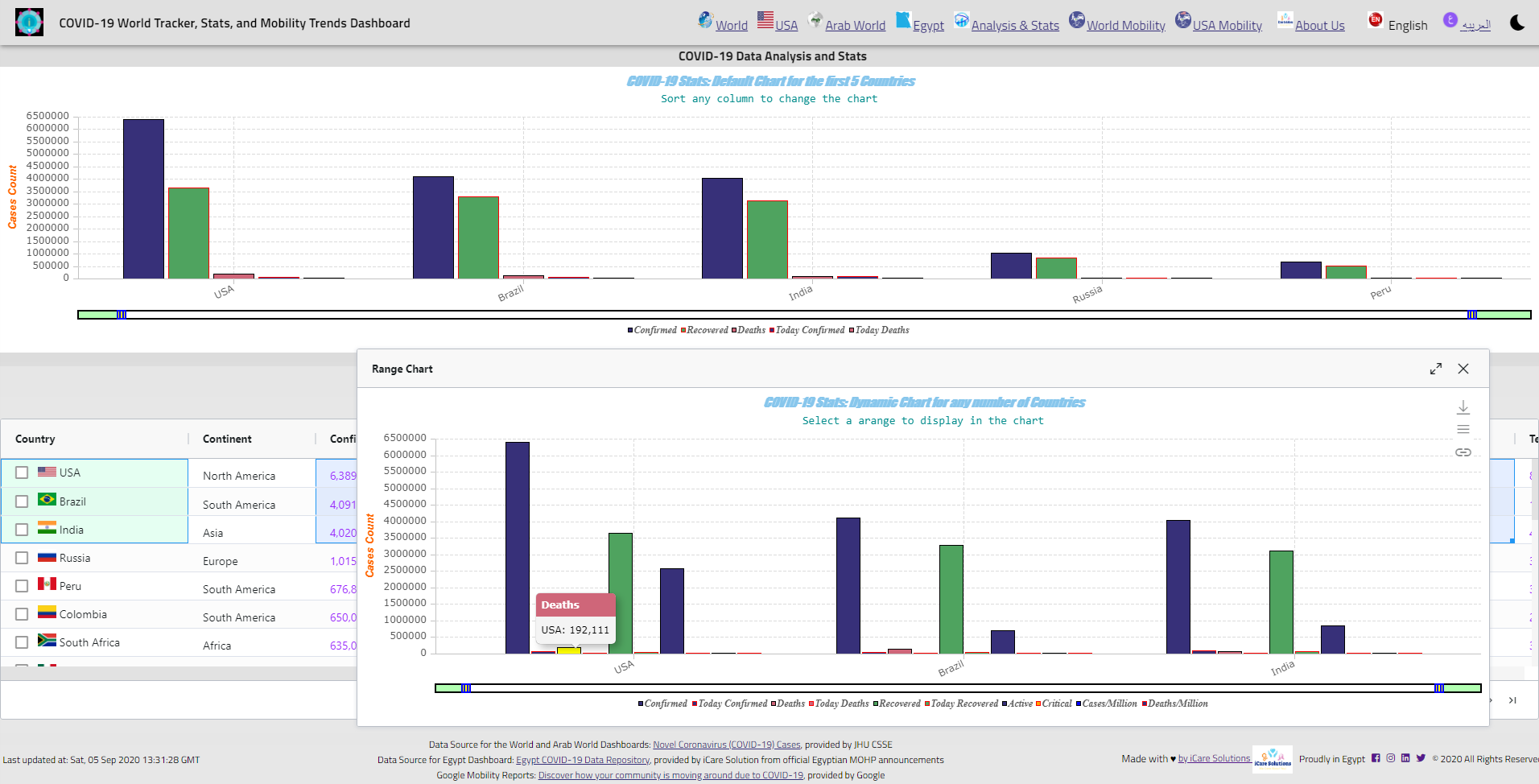
Figure 7. The Data Analysis and Stats Dashboard with Dynamic Graph for Country Comparison
The Graph is fully customizable and the user can configure the Graph Data, Settings, and Format (shown in Figure 8).
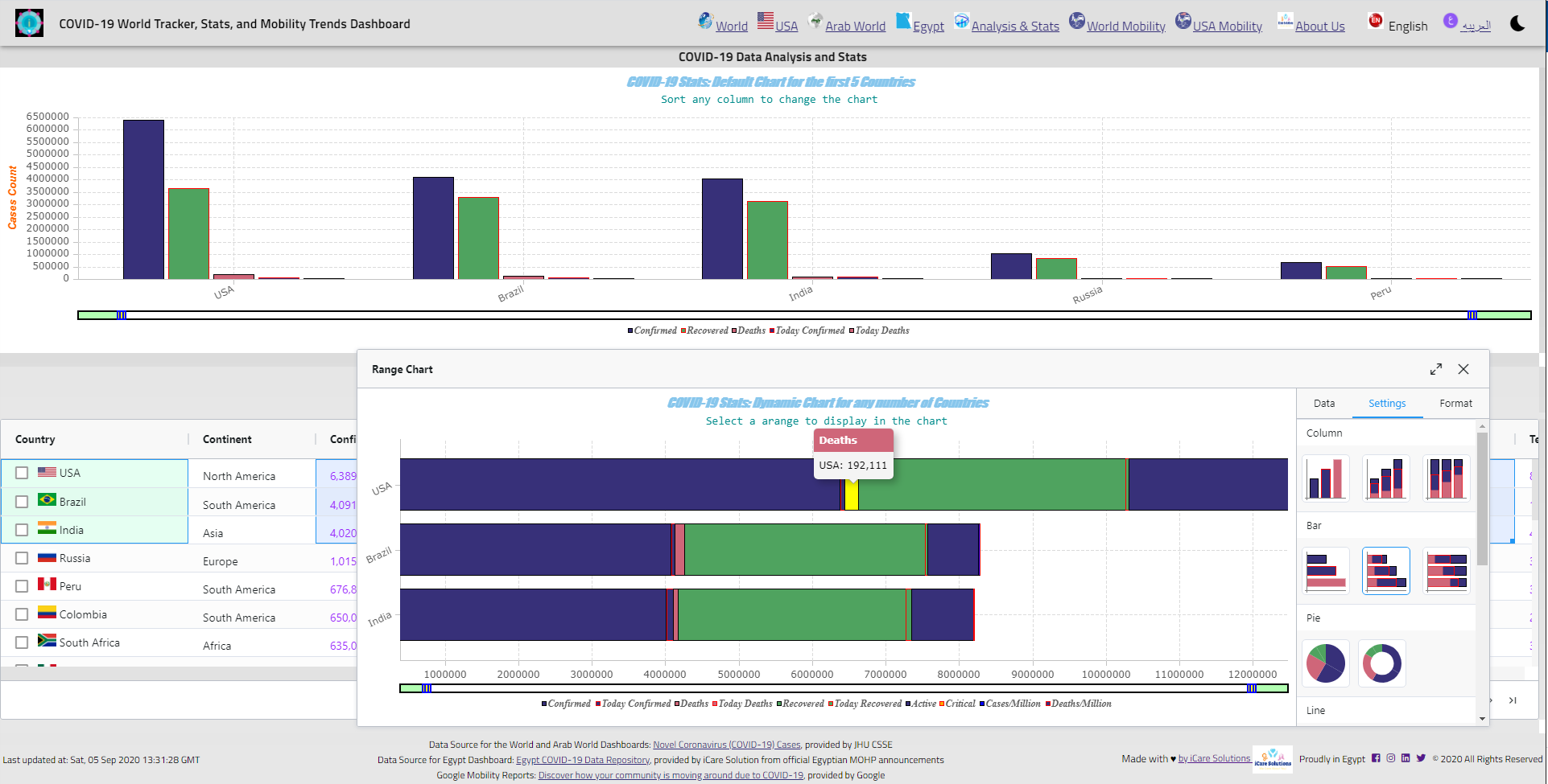
Figure 8. Customizing and Configuring the Graph
The World Mobility Trends Dashboard includes an interactive data grid for Google Mobility Reports along with a Default Graph for the selected country (shown in Figure 9 for the US) and a Dynamically created Graph for comparing the data across any number of countries (shown in Figure 10 for comparing Egypt, US, and Germany).

Figure 9. The World Mobility Trends Dashboard with Default Graph for a Selected Country
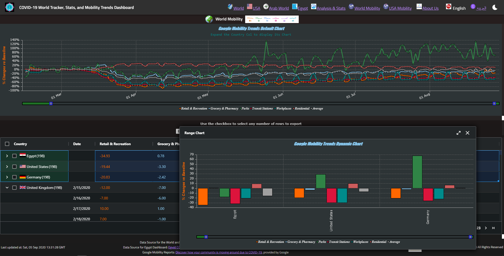
Figure 10. The World Mobility Trends Dashboard with Dynamic Graph for Country Comparison
The US Mobility Trends Dashboard includes an interactive data grid for Google Mobility Reports along with a Default Graph for the selected State or County (shown in Figure 11 for the State of Alabama) and a Dynamically created Graph for comparing the data across any number of states or counties (shown in Figure 12 for State Comparison).
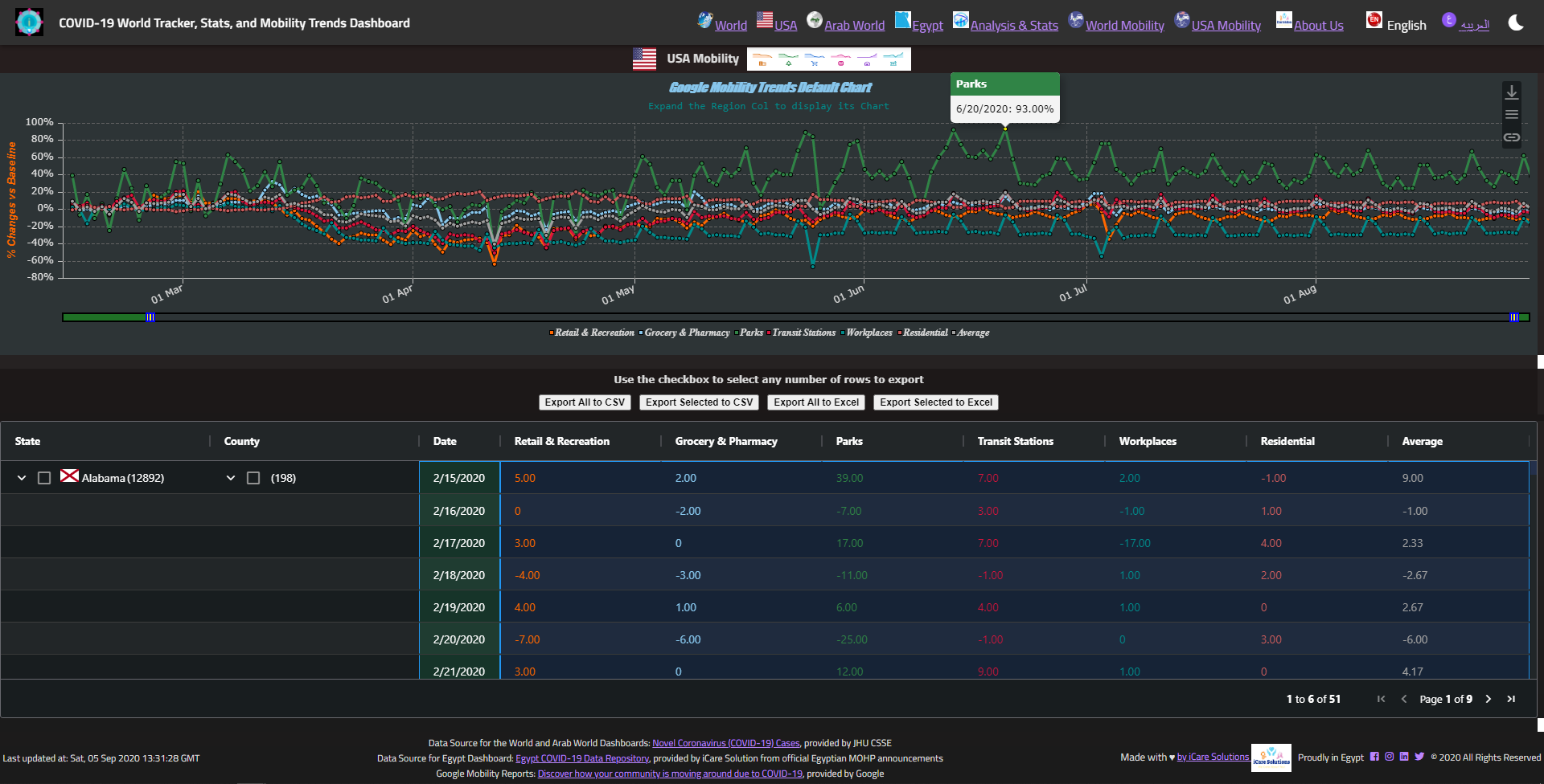
Figure 11. The US Mobility Trends Dashboard with Default Graph for a Selected State
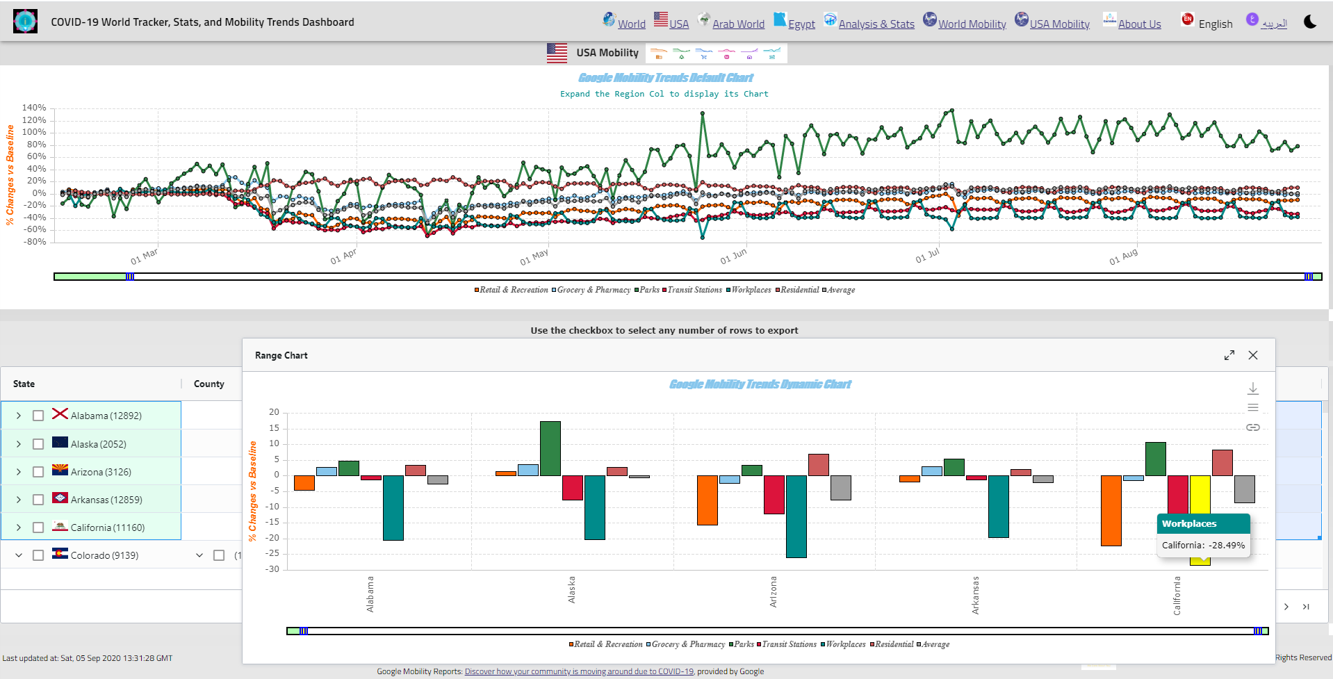
Figure 12. The US Mobility Trends Dashboard with Dynamic Graph for State Comparison
The US Mobility Trends Dashboard allows comparing both states and counties (shown in Figure 13 for County Comparison).
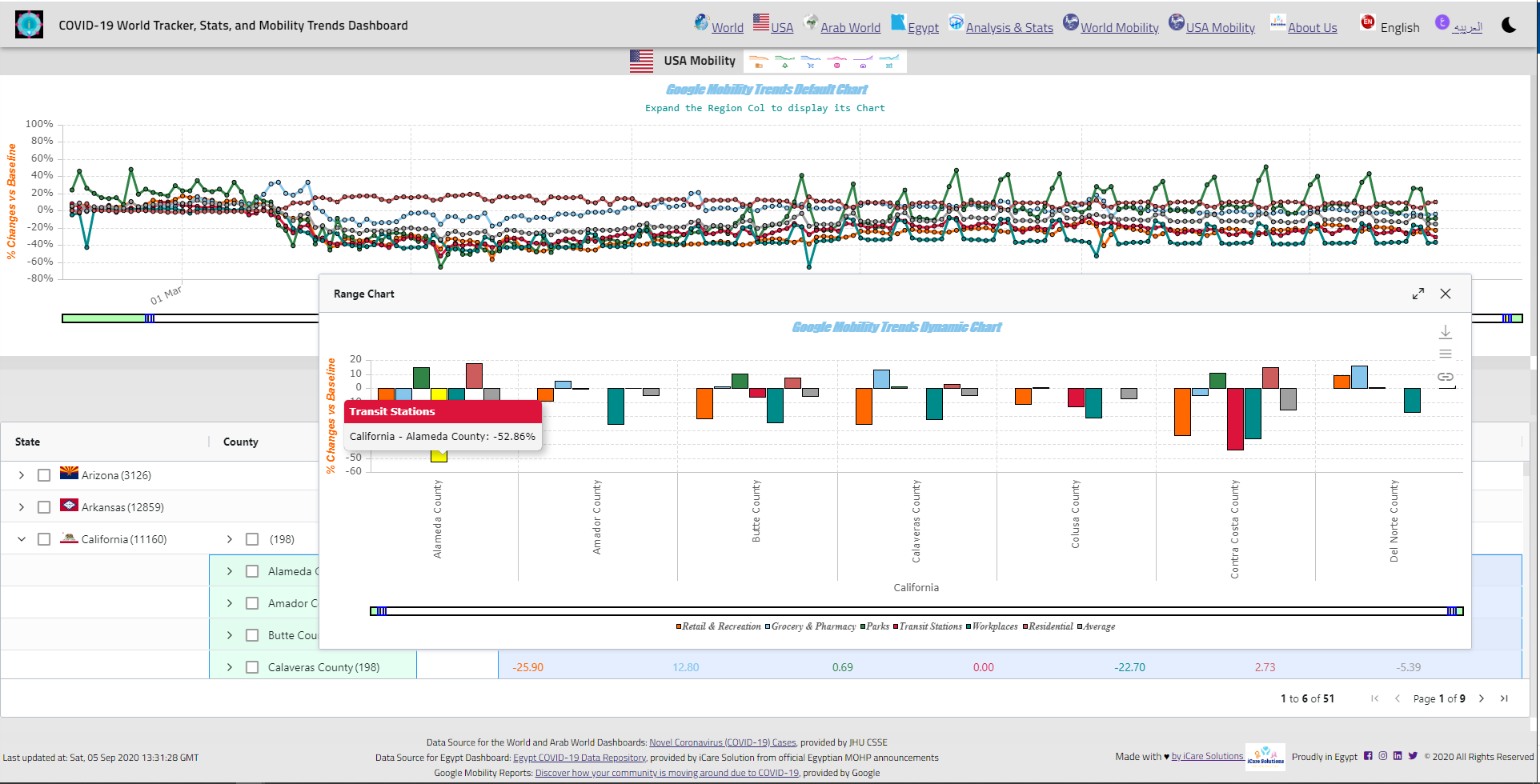
Figure 13. The US Mobility Trends Dashboard with Dynamic Graph for County Comparison
The App collects and displays latest COVID-19 news in Arabic or English depending on the chosen language. The App has Dark and Light themes and supports both Arabic and English and the user can easily switch between them from within the App.
The App has responsive design and can run on Desktop, Web, Tablet, and Mobile. It can be installed as a Progressive Web App (PWA) to run as a Standalone App on Mobile devices (shown in Figure 14).
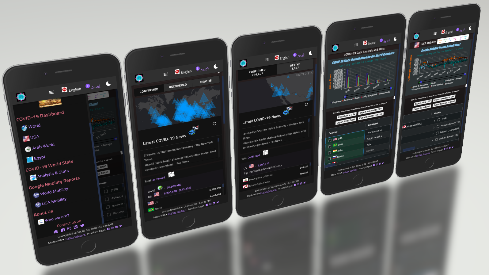
Figure 14. The App on a Mobile Device
The Main App is available at https://covid19.icare-solutions.org and the English version is available at https://covid19.icare-solutions.org/en/. You can install the App on your device by adding it to your “Home Screen” on Android and iOS devices. You can also download the Android version of the App at http://icare-solutions.org/?page_id=240.
About iCare Solutions
Founded in 2020, iCare Solutions is specialized in providing personalized software solutions that can benefit society and help making people’s life better. The company offers a wide range of products and services designed to promote the digital transformation of Healthcare, Education, and Insurance Industries in Egypt and across the Globe.
The post iCare Solutions Announces a New Release of its COVID-19 Dashboard with more Coverage for the US first appeared on PRUnderground.
Original Press Release.
