Feature your business, services, products, events & news. Submit Website.
Breaking Top Featured Content:
Should Chatbots Replace Forms On Mobile?
Should Chatbots Replace Forms On Mobile?
Suzanne Scacca
I recently was on Jeff Bullas’ website when I encountered a pop-up promoting an ebook. Nothing about that seemed too out of the ordinary. However, what struck me as odd was that the CTA wasn’t an Email field and “Submit” button.
Instead, it just had a blue “Send to Messenger” button.
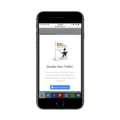
To be honest, I was shocked to see that anyone would send their website visitors to engage with a Facebook Messenger bot. But when I shared this with web developers and designers, most of them responded with “That’s the direction marketing is going.”
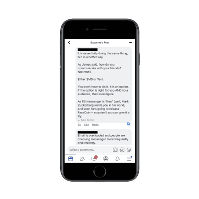
But…is it?
Whether you put a chatbot on your website or direct visitors to one hosted on Facebook Messenger, is that a better solution for capturing leads and other contact information than with a traditional form? In all honesty, I’m not totally convinced that a chatbot can and should replace mobile forms (or just forms, in general).
That’s why I’m bringing this topic to you, so we can look at this from all sides to decide what really makes the most sense.
What’s Happening With Mobile Forms?
About a year ago, I noticed an odd trend. Many times when I went to search for a Contact page in the navigation of a website, it wasn’t there. So, my next step was to scroll to the footer and see if they’d hidden it away there. That’s problem number one.
There were also cases of websites that advertised a Contact page, only for it to turn out to be a Help Center or FAQs page. That’s problem number two. If you want visitors to support themselves, be clear about where you’re sending them.
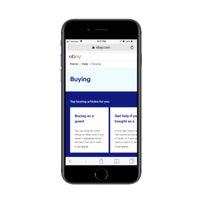
eBay sort of does this by labeling it as a Help & Contact page:
If visitors are willing to scroll through this self-help center, they’ll eventually reach some contact options:
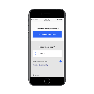
Note, however, that there is no contact form to be found, neither for basic inquiries nor support.
Hubspot does something similar. When visitors click through the navigation to eventually find About > Company > Contact Us, they’ll see phone numbers, a fax number, a physical address and a link to Support.
This is what the support page looks like:
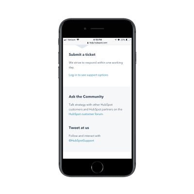
Again, there are no forms available. I’m assuming the support portal has them, but they’re nowhere to be found in the Contact or Support options on the website.
So, what does this mean?
Are visitors so fed up with filling out mobile forms that websites are ditching them altogether?
“
What’s interesting about these two particular examples is that there are no chatbots or even live chat widgets to replace them. There just aren’t any easily accessible contact forms.
As a consumer, this is something that frustrates me to no end. I know how websites work. When I see a “Contact” page, I should have contact options readily available, not a bunch of questions I have to sift through on my own.
As someone who specializes in web design and marketing trends, I kind of get it. We have to build experiences that visitors will actually respond positively to. If forms just aren’t getting the levels of engagement you need, then ditch them. However, I think there needs to be a better replacement for them than a Help Center and list of phone numbers.
Which is why I find chatbots as an alternative an interesting possibility.
Are Chatbots Any Better?
A lot of chatbots you see on websites are strictly navigational.
Hey, what are you doing here today? How can we help?
Similar to the examples above, they just provide visitors with a list of helpful responses or pages to explore.
Drift is a company that’s in the business of building conversational marketing tools (i.e. chatbots). So, it’s no surprise that its website would utilize one in lieu of a contact form. The only problem is that it tries to do more than that. Here’s what I experienced:
I located the Contact option labeled as “Talk to Us” in the footer:
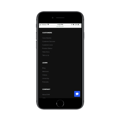
DriftBot then opened with a friendly greeting and prompted me to ask a question:

This was the question I asked since I figured it would be something a marketer or business owner was curious about:
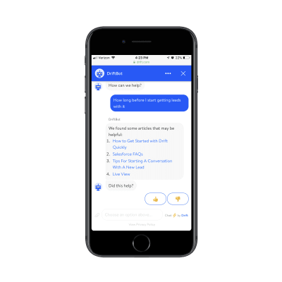
All DriftBot did was link out to a bunch of articles that didn’t really match any of the keywords in my question. As a result, I found the response unhelpful, which is why I marked it as such:
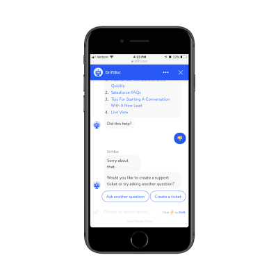
Eager for human assistance, I selected the option to “Create a ticket”:
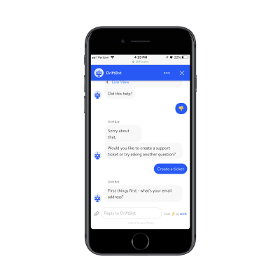
Only then did Driftbot finally take me through the options of filling out a support ticket/contact form:

What stinks about this exchange is that the chatbot not only wasted my time with ill-fitting self-help resources, but it wasted my time with unnecessarily long contact form questions. That’s one of the things we talk about all the time in designing forms for mobile:
Keep the labels short.
In this case, I absolutely do not think that chatbots should replace forms. It might seem faster or more natural to provide a response in a conversation-like format, but that doesn’t matter when that conversation takes you on a detour from the one thing you wanted to do.
It’s like what İlker Köksal of BotAnalytics said:
About 40 percent of [chatbot] users never get past the first text and another 25 percent drop off after the second message.
It’s because of chatbot exchanges like the ones above. When you make it overly complicated or when you violate the rules of good design etiquette, how can you expect visitors to want to engage with your chatbot branded as a contact form replacement?
That said…
I do think there is an argument for chatbots replacing forms in certain cases. Let me explain.
When Should Chatbots Replace Mobile Forms?
Funny enough, a report from Drift (and partners) reveals why you might want to replace mobile forms (at least some of them) with chatbots.
Let’s start by looking at the most commonly reported frustrations consumers express with websites:

A lot of this has to do with how difficult it is to navigate or get specific details from a website. If that’s the case, then chatbot widgets that live in the bottom corner of a website would actually be perfect for that purpose.
Now, 31% say that it’s hard to get answers to simple questions and 22% say that online forms were poor quality. In that case, the Contact page chatbot would work well if it were simply there to make the contact form experience feel more personal.
The Drift report also shows consumers’ responses for when they believe a chatbot would be useful:
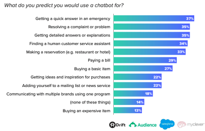
You can see that there’s a lot that people want to be able to do with chatbots. As mentioned before, though, you must be careful with them. If they’re not configured to handle complicated requests or questions, you might end up frustrating users more than satisfying them.
That’s why chatbots might actually be best as a replacement for very simple and predictable mobile forms. For instance:
Basic contact forms, of course, can be replaced by chatbots if you want to add just a tad bit more flavor to the exchange. Just be mindful of your visitors’ time. Landbot has a nice example of this on its Sales contact page:
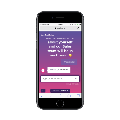
You can see that it’s slightly more expanded from what you’d ask for on a contact form. However, it works in this case:

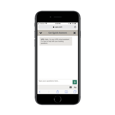
You might also want to replace a basic support form with a chatbot so long as you’re clear that it only handles basic requests. This would be good for an e-commerce website that can retrieve details from tracking IDs and orders, as in the case of UPS:
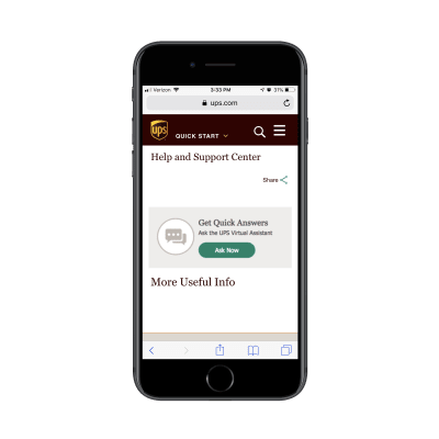
As you can see, the chatbot even reinforces this idea by telling visitors it will help with tracking-related questions:
Order forms with preset options that visitors just have to click on would be good. When you remove the possibility of visitors throwing unpredictable questions or responses out there, your chatbot can successfully replace a form, like the case of Dom from Domino’s:

You could also use a chatbot to power other simple form-type engagements on your mobile website. For instances, surveys with multiple-choice answers and quizzes with preset options could easily translate well to a chatbot.
Lead generation forms in pop-ups (like the Jeff Bullas example) or on landing pages might make sense. After all, how much could a chatbot possibly screw up the collection of an email address and a name?
That said, with pop-ups, your only option is to use Facebook Messenger. And, to be quite frank, I’m not a fan of handing over any more data to Facebook than is needed — especially something as valuable as your list of leads.
What About Facebook Messenger Chatbots?
Drift’s survey found that 27% of people would be opposed to engaging with a chatbot if they could only do so through Facebook:
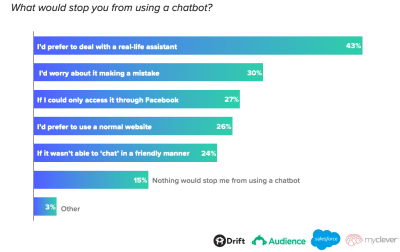
That’s not surprising at all considering the security issues and privacy concerns surrounding the social media platform.
But what about all of those people — including my colleagues from earlier — who seem more than happy to use Facebook Messenger to power their on-site bot? Even Neil Patel buys into it. He says that his Facebook Messenger bot gives him an 88% open rate and 56% click-through rate.
I certainly get the appeal as you don’t have to worry about follow-up emails going unopened or lost to spam forever. However, I’m just not sure that Facebook should be the vehicle through which we power our chatbots. I’m also not sure how much longer consumers will be okay with it either.
One of the reasons why I say that is this:

It’s bad enough that websites are now littered with cookie consent messages, reminding us of how unsafe it can be to share data online. Now, our engagement with a CTA button is telling us that Facebook wants to do even more tracking while we’re on the website?
To add more fuel to the fire, this is what happens as a next step:
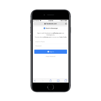
Because I’m being directed from the Jeff Bullas website to Facebook, I can’t actually be moved to my Facebook or Messenger apps. Unfortunately, mobile browsers just don’t have the ability to connect to apps that way; only other apps can.
How many Messenger users do you think actually know what their Facebook login information is? So, what should be an easy one-click login step has now become a pain in the a** for mobile users.
Honestly, I think that anything that pushes visitors away from your mobile site is a bad idea. I get that email can be a hard nut to crack sometimes. As Larry Kim summarized in this Hubspot podcast:
Typical open rate for emails is 5-10%, so 90-95% of people aren’t engaging; open rates for chat marketing are 70-80%, and click rates are 10-20%.
But here’s the thing: they’ve already taken the first step in giving you their email address through the chatbot. It’s not like you’re contacting cold leads. There’s no reason to think that only 10% of those chatbot contacts would open your emails.
So, even though Facebook Messenger might make it easier to implement a chatbot and relieves your site and server from having to host your own chatbot solution, I’d say you should avoid this one at all costs.
Wrapping Up
Honestly, I have no problem with chatbots replacing mobile forms so long as:
- They’re used in the right place and at the right time.
- The purpose of the chatbot is made clear.
- They replace only the simplest of forms.
When done right, chatbots can reduce the need for typing, decrease the intimidation of answering a bunch of questions, and make a form feel more like a conversation.
 (ra, yk, il)
